BACK
14:52:43 UTC
JusticeText is a legal-tech platform that helps public defenders manage video evidence.
internship
JusticeText helps public defenders search, annotate, and organize hours of police video and transcript evidence. In summer 2024, I joined the team as a product design intern, where I focused on redesigning a critical but underperforming feature: the Notebook.

Notebook was one of the least-used feature on the platform.
Notebook is a key workflow within a larger product meant to support active case preparation. It was designed to deepen engagement during video review. When usage stayed low, it signaled that users weren’t fully activating the platform’s core value, impacting adoption, retention, and long-term product stickiness.
The original Notebook didn’t match how users reviewed video, or how they thought.
There was no clear place to start writing. Notes were saved in the order they were added, not in the order things happened. The list had no structure, no visual cues, and no connection to the footage itself.
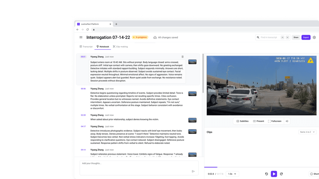
Original Notebook Interface

But fixing it wasn’t simple. We couldn’t disrupt workflows for users who were already using the platform.
JusticeText already had adoption across public defenders’ offices. That meant we couldn’t introduce entirely new interaction models or change how users navigated review. The redesign had to work within existing mental models, focusing on UI clarity, structure, and affordance, without touching the core playback or annotation logic.
So I focused on the biggest points of friction.
Rather than reinventing how the feature worked, we looked for where it was actively getting in users’ way. Three issues stood out:
Lack of Clear Entry Point
The old interface offered little visual guidance. A line of text was the only prompt, leaving users without visual affordance and unsure how notes would behave or where they would go.
No Link Between Notes & Video
While notes were timestamped in the backend, the UI didn’t make that connection visible. Users had no feedback about what they were anchoring or how to return to a moment.
Notes Ordered by Save Time, Not Video Time
In the original Notebook, notes were listed in the order they were added—not in the order events occurred in the video. This broke the flow of review and made it harder to reconstruct a timeline of events.
From Notes to Narrative
To understand why the Notebook wasn’t working, I stepped through typical review sessions end-to-end. I recreated common workflows using internal accounts and observed how users interacted with the tool across real cases.
Start the video
Watch for relevant moments
Take quick notes mid-playback
Return later to scan, recall, or export
I focused on three key actions:
Taking notes mid-playback: Users often paused briefly or typed while video played, expecting notes to be saved accurately and contextually.
Returning to notes later: Many tried to skim through past notes to find a moment, but the lack of timeline order made it slow and unreliable.
Trying to reconstruct a timeline: In longer sessions, users couldn’t tell which note belonged to which part of the video. It forced rewatching or external tracking.
What I found was consistent: defenders used the Notebook to track what happened, not just what they were thinking. But the UI didn’t reflect that intent. Notes appeared out of order, looked identical regardless of source, and gave no indication of what they were linked to.
In short: users didn’t trust the Notebook to capture what they saw.
They didn’t know if a note was linked to the video, if it saved correctly, or where it went. What should’ve been a lightweight way to track key evidence felt more like writing into a black box.
That led to three clear design decisions:
Make the starting point obvious
The input field needed to be always visible, clearly labeled, and visually tied to the video. Users should know exactly where to type, what will happen, and when it’s saved.
Reflect the timeline, not the typing order
Notes had to appear in the order events happened—not when they were saved. This change would help users reconstruct a narrative and reduce rewatching.
Introduce structure without adding steps
Each note needed enough hierarchy to be scannable (timestamp, speaker, content), but without requiring additional tagging or setup. The goal was clarity without complexity.
Before & After
I focused the redesign on the areas that caused the most confusion during review. Here’s how the new design resolved them:
No Clear Entry Point → Labeled, Persistent Input
Before
After
Before
A single unlabeled text line
No clear typing indicator
Users weren’t sure where to start or if the feature was working
AFTER
A fixed, clearly labeled input aligned with playback controls
Supportive empty state graphic prompting users to add their first note
Immediate visual feedback for first-time and returning users
Saved Notes Out of Sequence → Timeline-Based Sorting
Before
After
Before
Notes were saved in the order they were added
Reviewing felt disjointed—important moments appeared out of context
Defenders had to rewatch video to understand sequence
AFTER
Notes are automatically sorted by their video timestamp, not when the user typed
Each note is anchored to its corresponding moment in playback
Reading the list now reflects the actual timeline of events
Structured, scannable note cards
Before
Flat list of text with no hierarchy or visual cues
Hard to skim or compare notes
Everything looked the same, regardless of content or context
AFTER
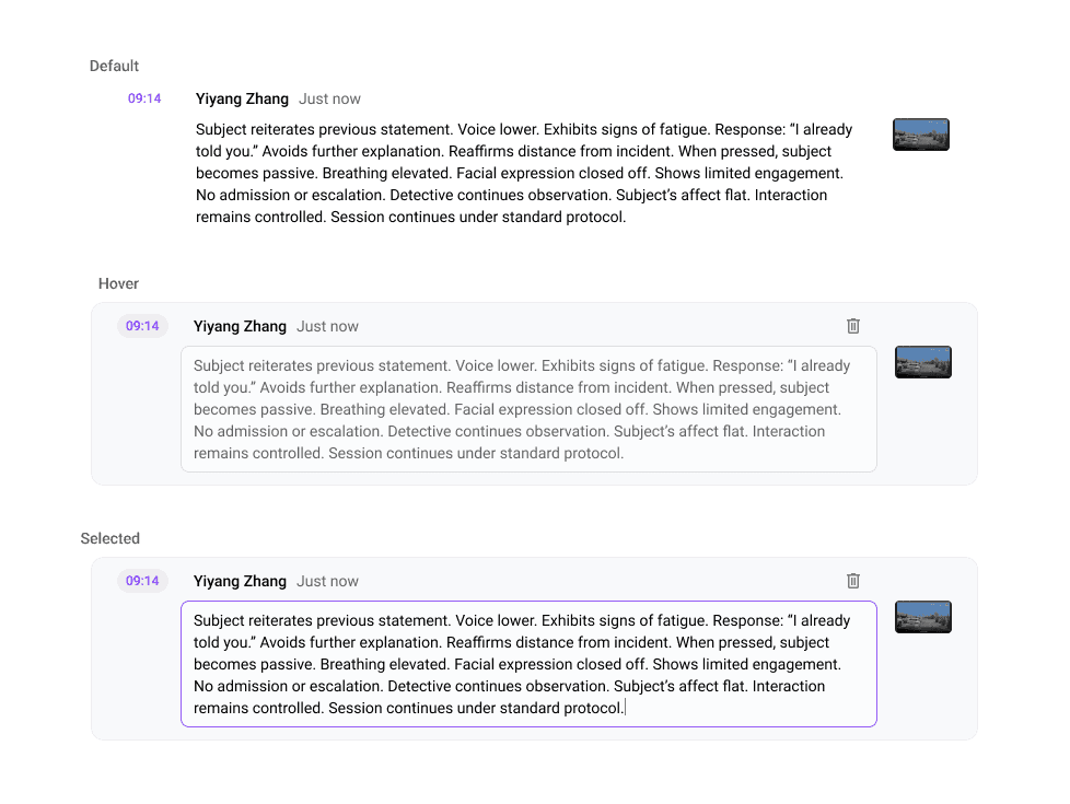
Notes are displayed as modular cards with timestamp, speaker, and content
Spacing and type hierarchy optimized for scanability
Easier to revisit, organize, and trust what was saved
Usage went up, because the friction went down.
JusticeText users could now take structured notes while watching video, confident that what they captured would be clear, organized, and easy to revisit.
Notes are now consistently ordered by video timestamp
First-time users immediately understand where to type and what will happen
Internal stakeholders noted improved clarity and better alignment with real defender & paralegal workflows
People weren’t ignoring the feature—they didn’t trust it.
This project taught me how small interface gaps, like unclear input or misaligned ordering, can block adoption entirely, even when the feature is critical.
By focusing on clarity, alignment with mental models, and reducing friction during note-taking, I helped reposition the Notebook as a tool defenders could actually trust.
Simple structure, shown at the right moment, can unlock complex thinking.
SEE ALSO